Upgrade your workshop with Apromas
Meet Apromas, a powerful automotive process management platform. Apromas exists to help workshops with production overview, quality assurance, staff planning, and time registration - to name a few. The great people at Apromas serve thousands of customers daily. 
The task
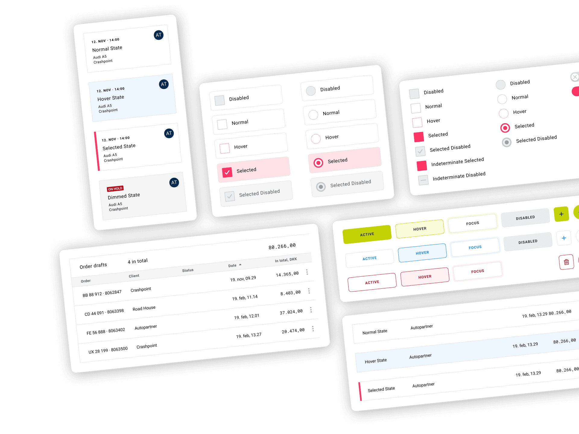
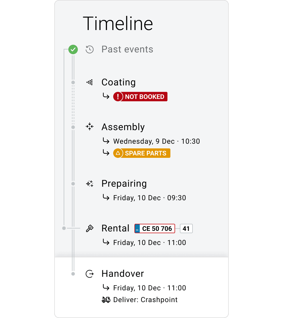
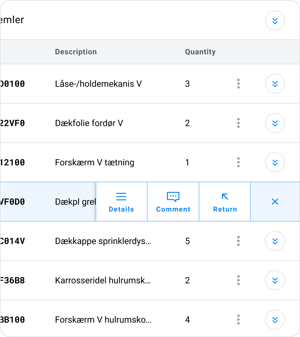
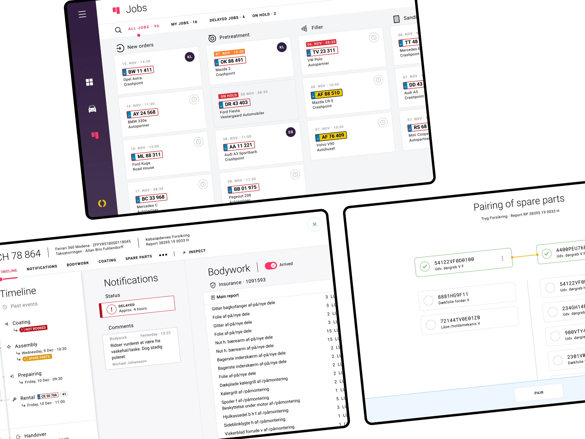
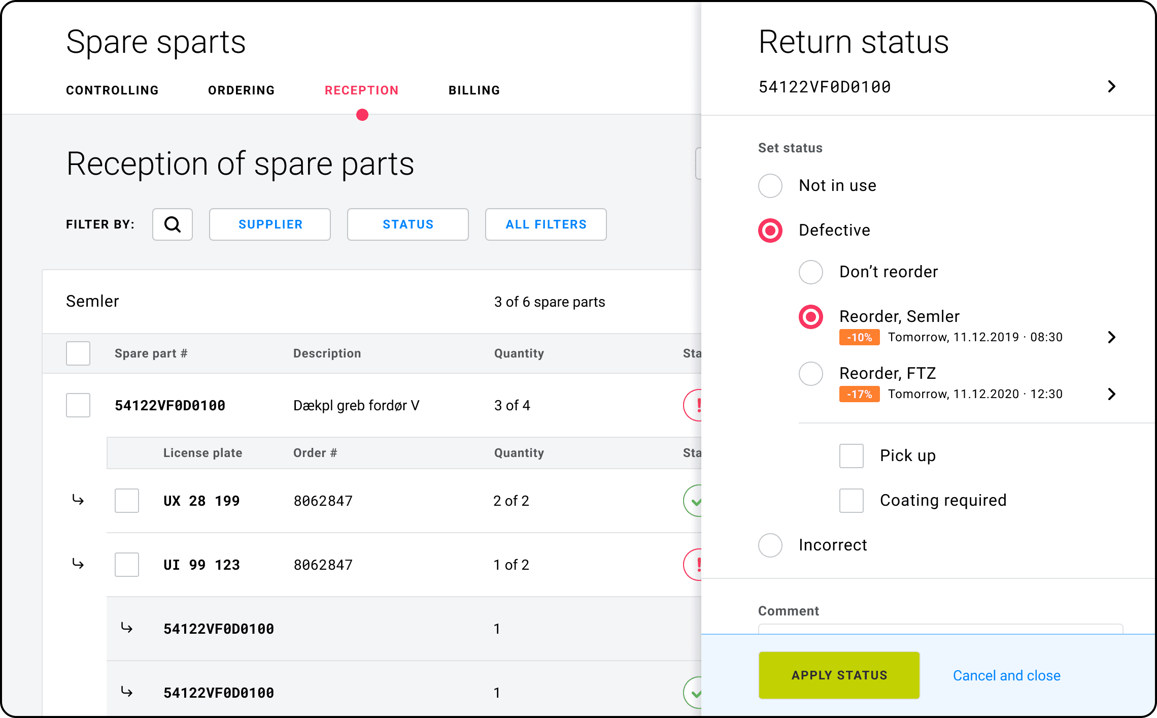
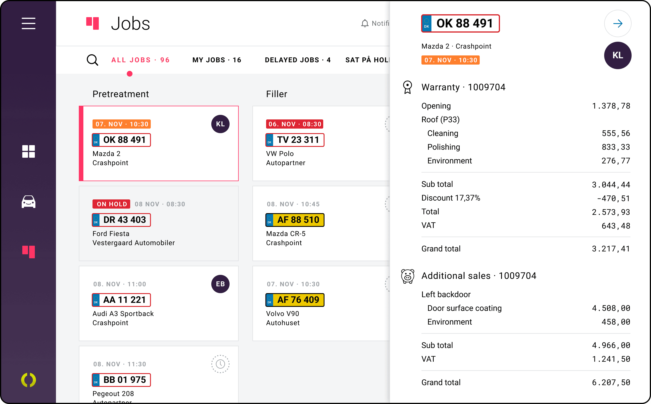
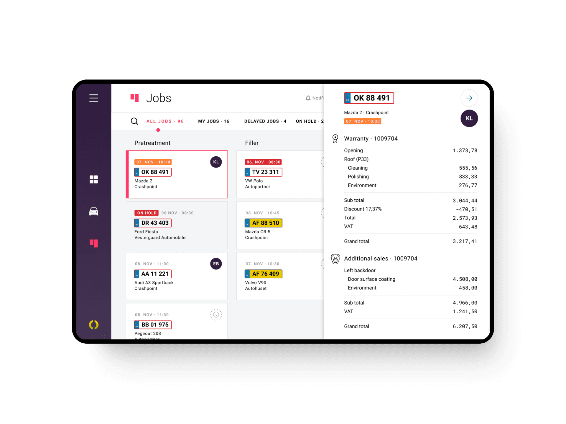
The Apromas platform handles complicated processes. Unfortunately, the user experience was also overly complicated. Time had taken its toll on parts of the software. In great companionship with the competent and super-friendly team, I continue to help shape the next generation of Apromas - and what a joy it is!
Apromas is now an intuitive automotive process management platform providing a complete overview of workshop resources.
My role
​​​​​​​•  Information Architecture
•  User Flow
•  Wireframing
​​​​​​​
•  Prototyping
•  Visual Identity and Assets
•  Design System Guidelines
​​​​​​​
•  Iconography
•  UI/UX Design
Stop by qars.dk  or apromas.dk to learn more. 
Colours with confidence
Apromas's old colour palette was traditional corporate shades of blue. I rebooted their colours completely. Their new, unique colour palette combines a feeling of authority with a slight hint of playfulness. All in all, this sets Apromas apart in a competitive and traditional industry.
Trust and steadiness
We needed a functional and stable typeface to convey trust and steadiness. It also needed to be legible even in smaller sizes and changing lighting conditions. We landed on Roboto - an open-source, grotesque sans-serif typeface released through Google. 
Spot the difference
We needed a typeface to display numbers effectively. Roboto Mono does an excellent job, as its letterforms are easy to distinguish from one another. Our secondary typeface was an easy choice.  
Important or not? 
All orders contain a worksheet, which gives the employee an overview of the job at hand. Depending on their profession, some areas of the worksheet may not be important to them, so they can toggle those areas on or off. 
Almost like a time machine
All orders go through nine steps to ensure everything is on track. To help keep the employee on track, we invented the timeline. The timeline is an integral part of the worksheet.  
The timeline offers the all-important order overview at a glance. We divided the timeline into three sections. 
1. Past events: By default, we collapsed all previous steps - no need to use screen real estate on things of the past.
2. Current and future steps: The current step of the order is highlighted, along with eventual errors. 
3. Final deadline: The final deadline is crucial to success. The content area sticks to the bottom of the screen and is positioned above the rest of the timeline. As a result, it is always visible.
Icons for every occasion
I created a set of 58 new icons for Apromas to use throughout the platform. When it comes to icons, consistency is king. Any given icon has a specific optical "weight" determined by fill, stroke thickness, size, and shape. Keeping those parameters the same across icons builds consistency and a more harmonious feel.
Ready, set, go!
Often used tools are right at hand by the inline action bar.
Contextual editing
We introduced the slide-in pane to reduce page reloads and maintain context. It's an efficient way to present relevant content. Whenever needed, we added a sticky action bar to the bottom of the pane. 
Like what you see? Let's talk!
Back to Top