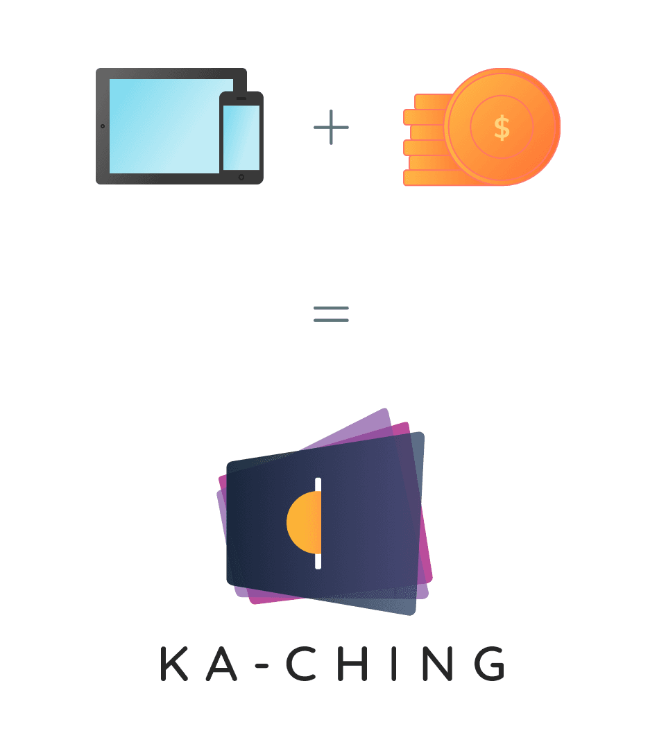
Ka-ching
A Simpler Point of Sale
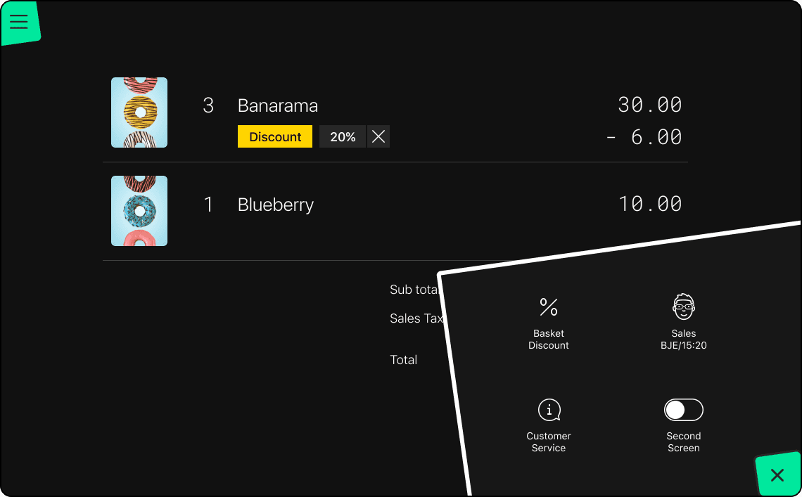
Ka-ching! Omnichannel POS. Done Right!
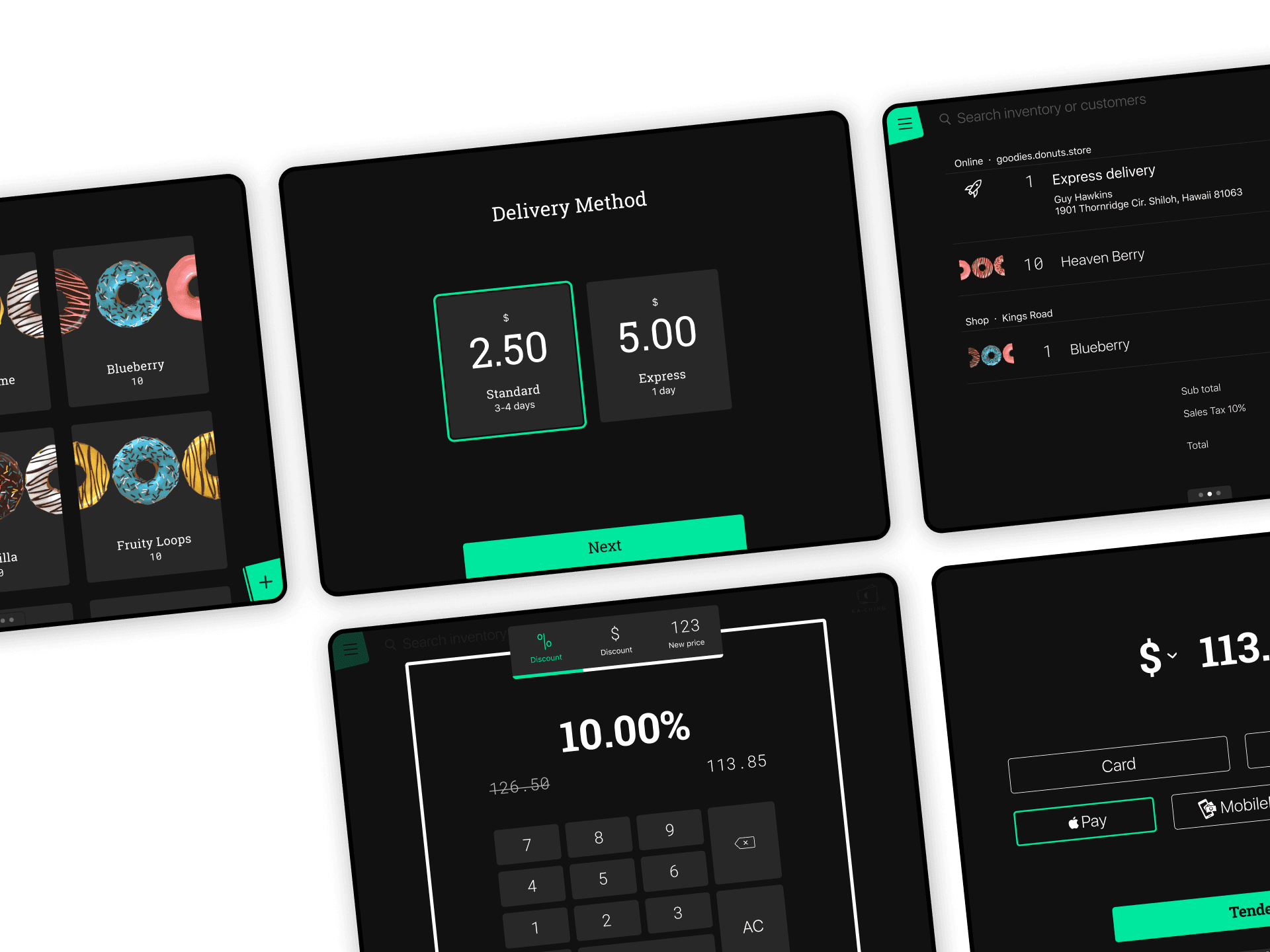
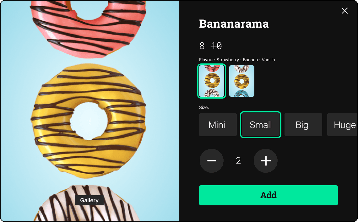
Ka-ching is a Point of Sale system that connects e-commerce and physical retail in new and exciting ways. It creates new shopping experiences and better customer journeys. The result is higher conversion rates - and happier employees.
The task
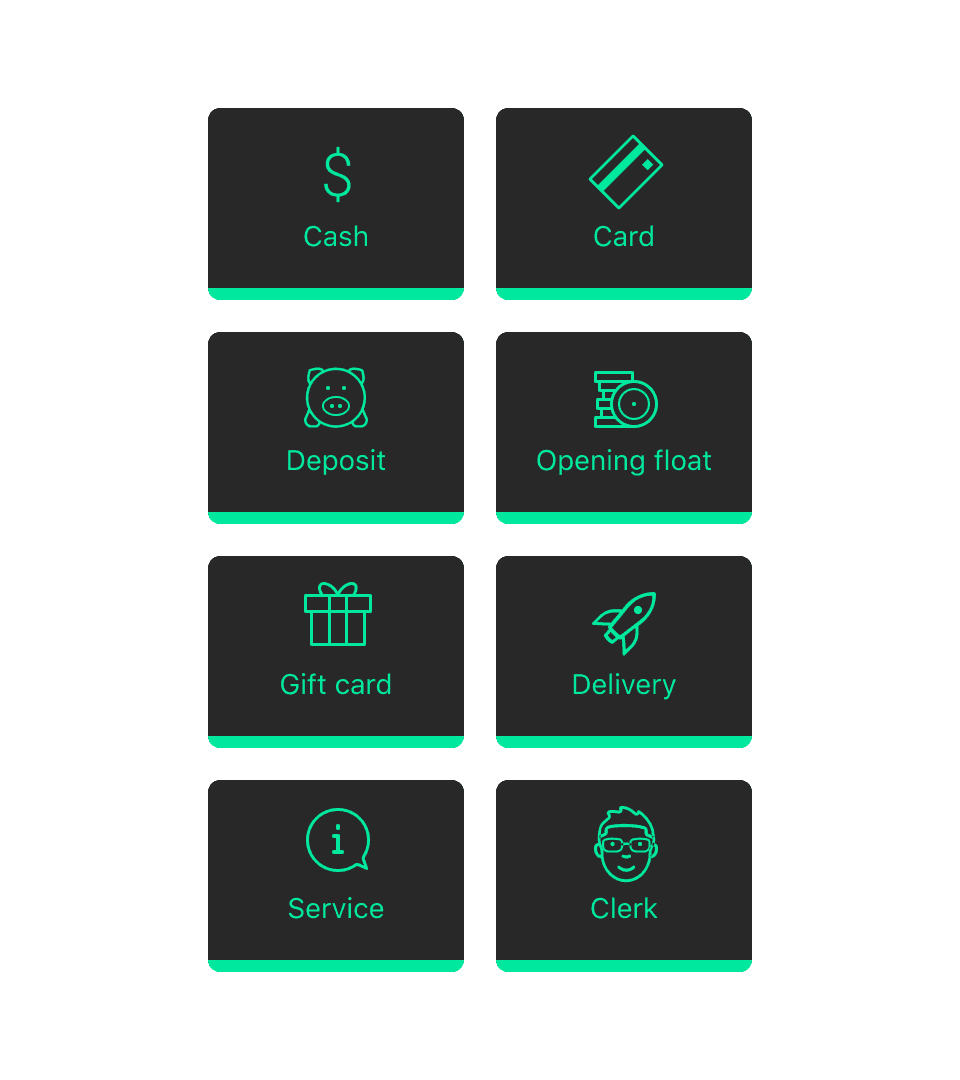
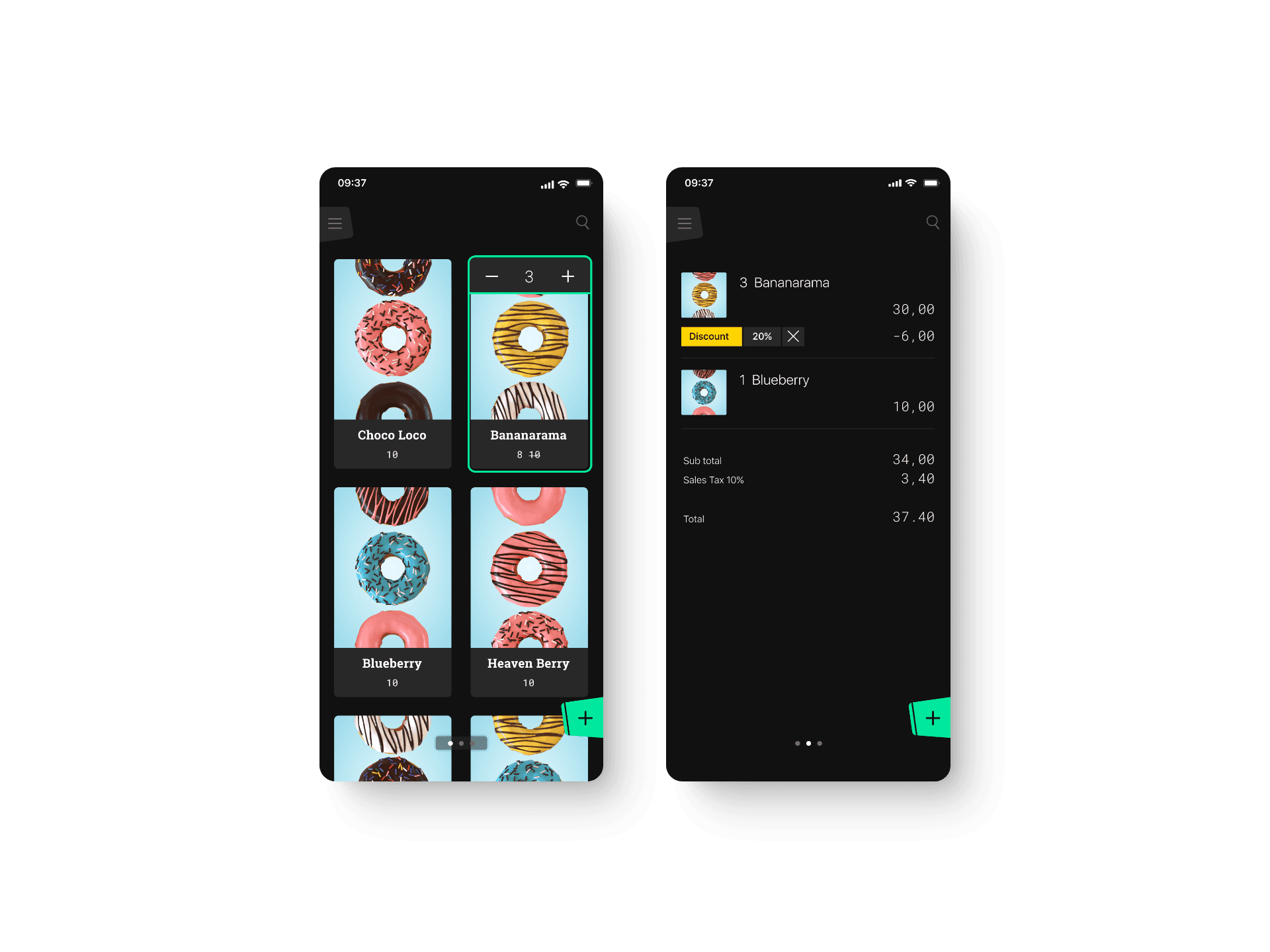
Your ordinary POS has too many buttons and is a pain to use. I'm on a mission to change that. Together with the other Ka-chingers, I have set out to make the world's most well-designed and easy-to-use POS.
Ka-ching is the perfect solution to omnichannel retail and for all those who want to give customers an ideal shopping experience.