Gain insights into the social dynamics of the class
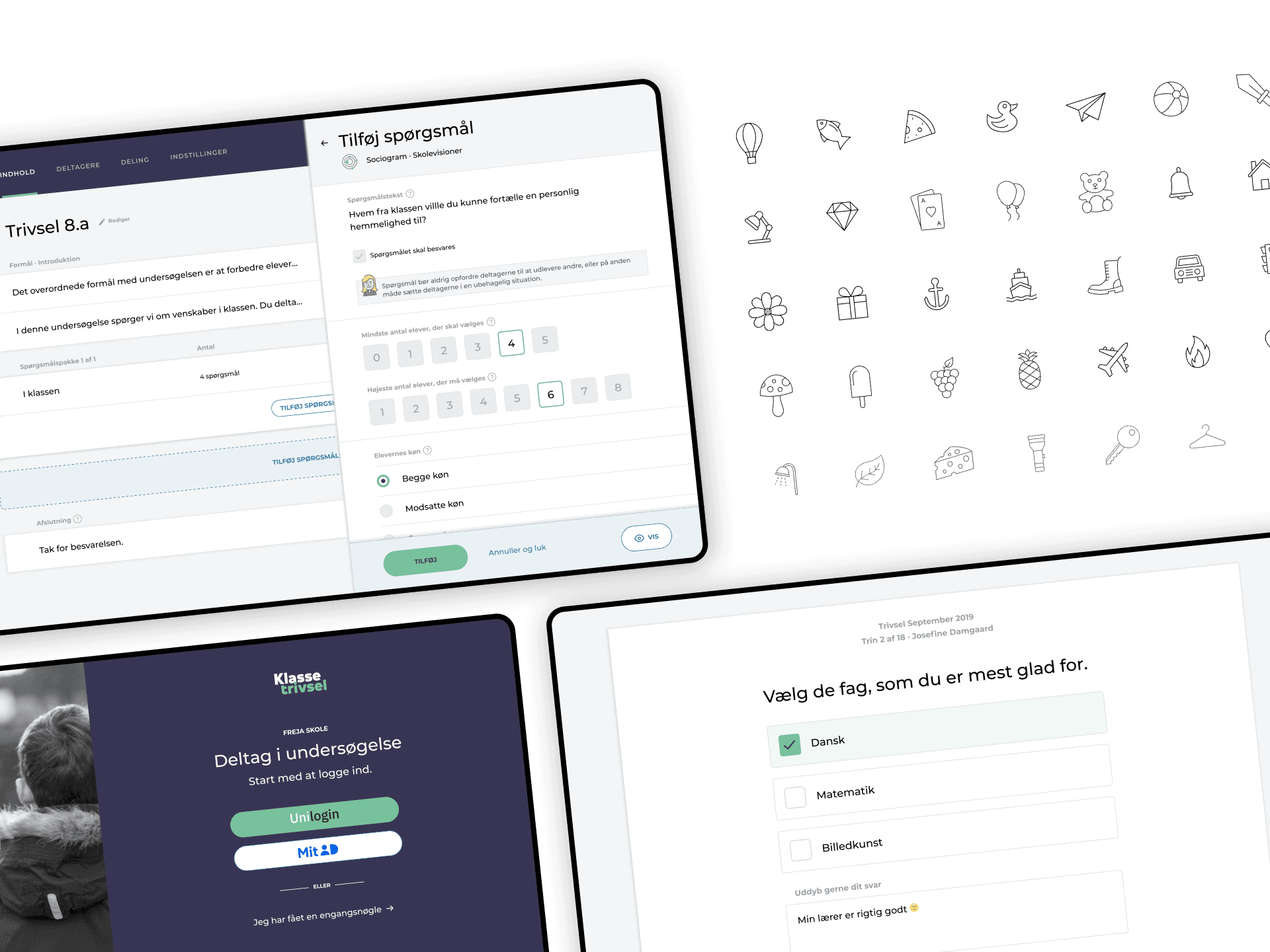
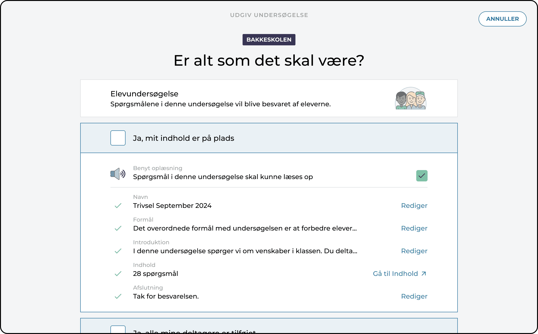
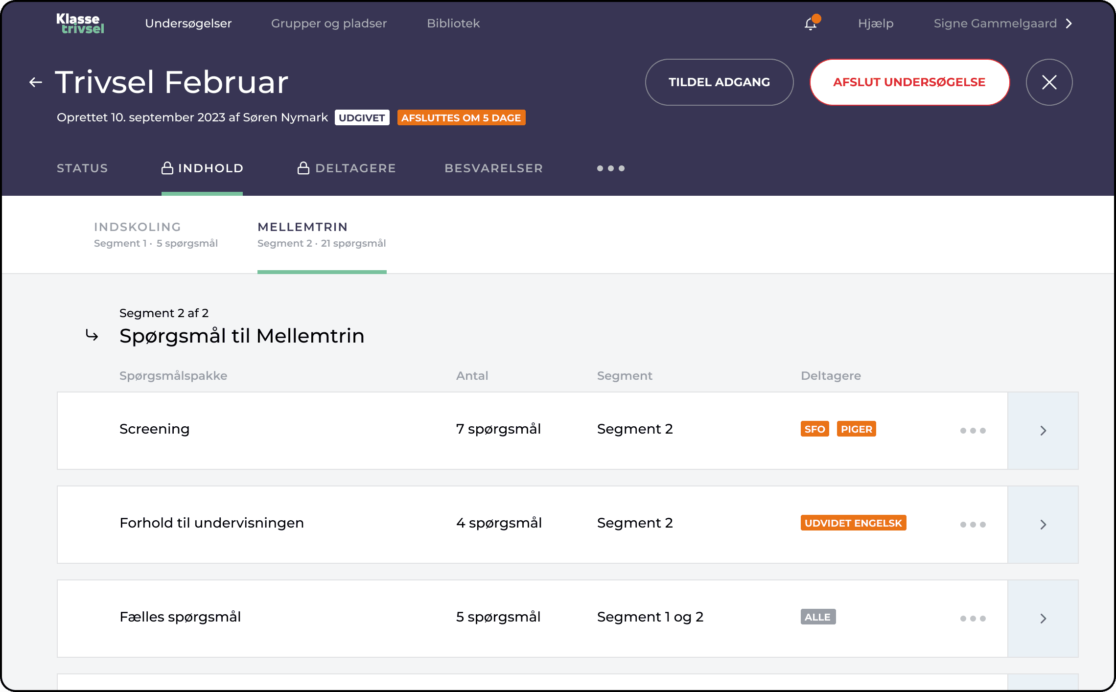
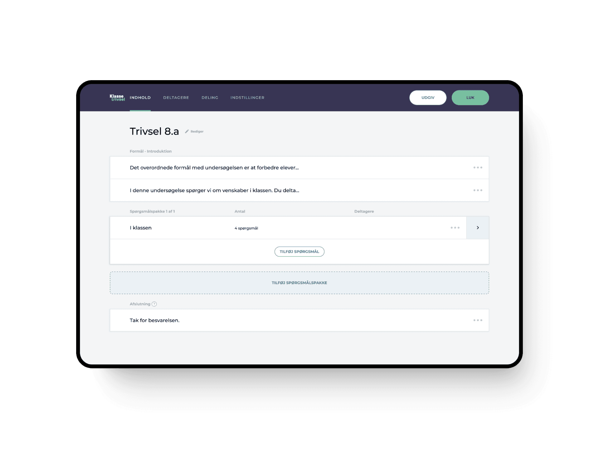
Klassetrivsel is a web-based digital tool for measuring school climate and students emotional well-being. The dedicated and passionate people of Skolevisioner strive daily to make Klassetrivsel even better. And since they are market leaders in both Denmark and Norway, they obviously do a good job. 
The task
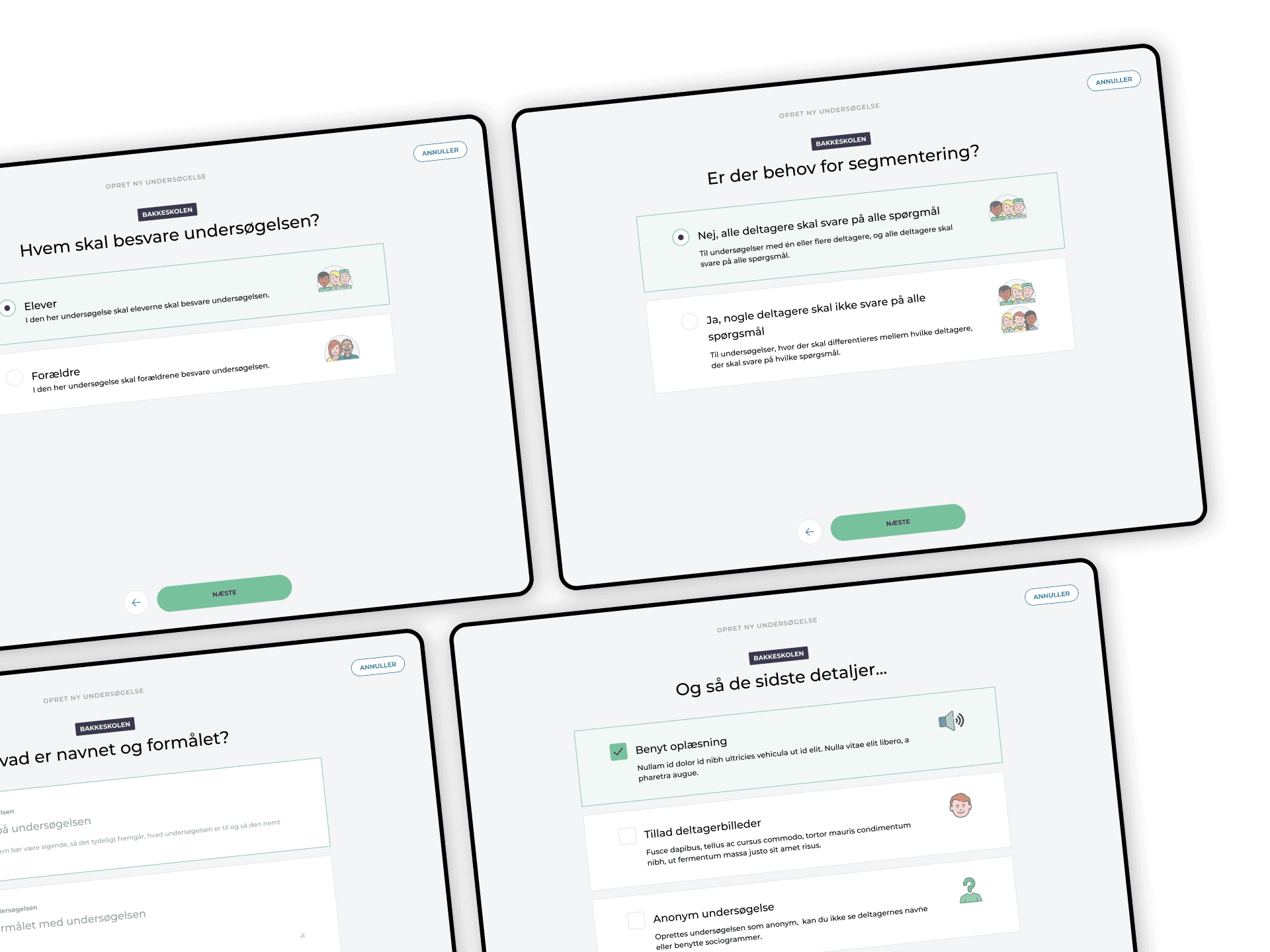
Being an elderly platform, Klassetrivsel needed to gear up. So, I helped them with a complete re-design, re-thinking, re-imaging, and re-everything. I'm still part of the team, and for that, I am grateful. It's an absolute joy!
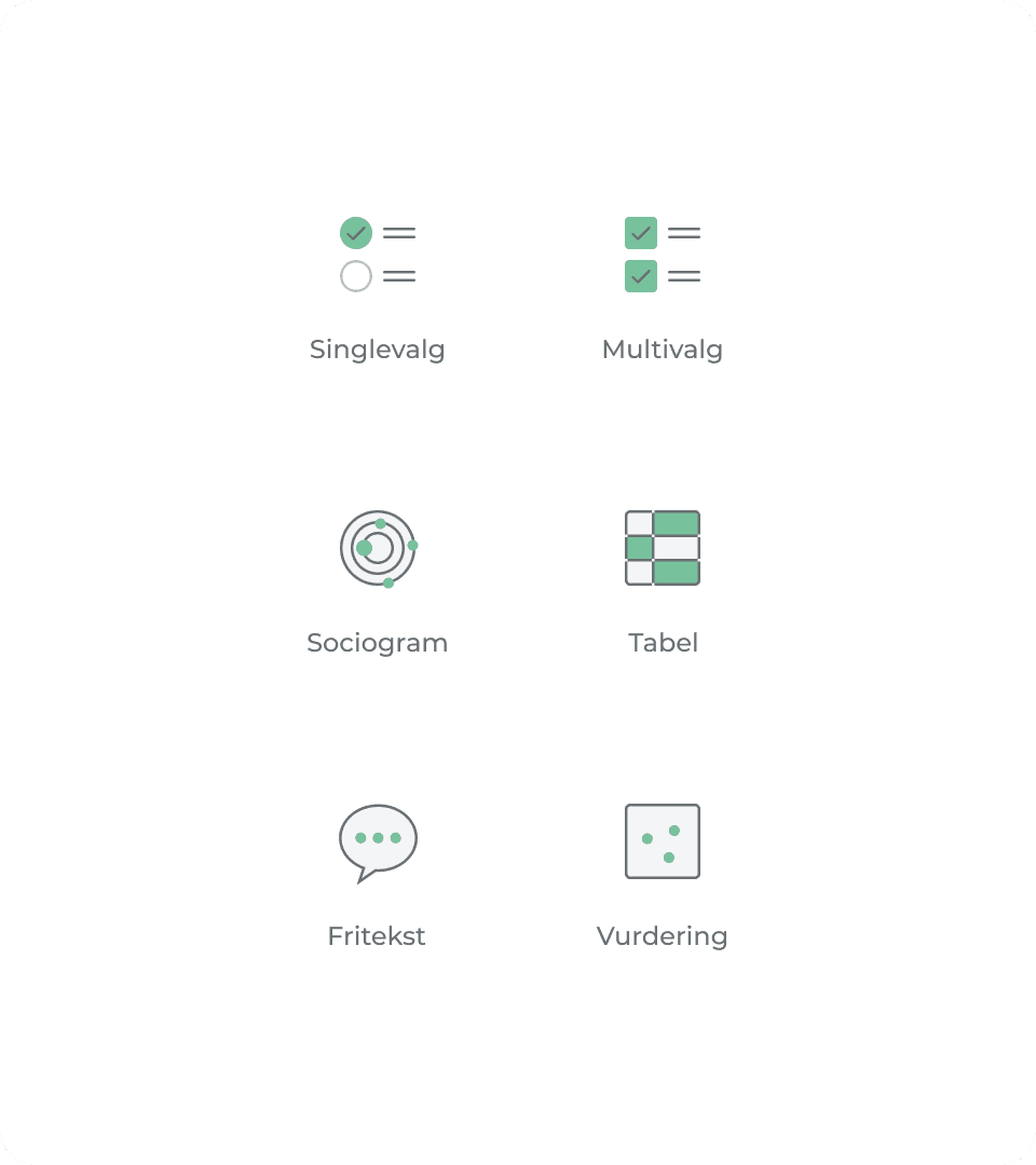
A multi-year relationship to create a new digital platform from the ground up. A strong focus on a compelling UI and innovative UX has paid off. The all-new and vastly improved Klassetrivsel clearly outperforms its competitors.
My role
​​​​​​​•  Information Architecture
•  User Flow
•  Wireframing
​​​​​​​
•  Prototyping
•  Design System Guidelines
​​​​​​​
•  Iconography
•  UI/UX Design
Stop by klassetrivsel.dk  or skolevisioner.dk to learn more. 
Product icons
The primary purpose of any product icon is to provide a unique visual cue and, just as importantly, to differentiate the products visually.
Access granted
Dealing with passwords always causes friction. Sometimes a lot of friction.
When a student attends a specific survey in Klassetrivsel, they need to log in using a teacher-provided password. The password combines characters and digits - always ten in total.
We did three things to make it easier for the student.
1. We unmasked the password, thereby enabling the student (and the teacher helping) to check input while typing.
2. We reserved an input field for each character/digit allowing for super easy progress tracking.
3. Lastly, we disabled the Call-to-action button until the student entered the correct password.

SOS - help needed!
Quite often, your users want to find a solution to their problem at hand. And more often than not, they fail to do so. Why? Usually because no one considered introducing various levels of help into their software.   
In Klassetrivsel, we provide four different paths to an answer. All four ways are part of the help hierarchy established for Klassetrivsel.
1. Contextual text, set with a lower contrast is a subtle way to provide awareness for those who need it without disturbing more skilled users.
2. Contextual text + help icon or a "Learn more" link automatically obtain a more prominent position in the interface.  
3. Large icon + text for when you really want to draw attention to the helpful information presented.  
4. The help centre is the place to collect all content related to supporting the user, including FAQs, a knowledge base, how-to videos, and more.
Editing with an overview
All editing or creation of questions and packages takes place in the slide-in pane. This ensures optimum focus while keeping context. 
All set or not?
A final check before publishing a survey is reassuring. Think of it as a helping hand from our side.
It's all in the details
Every survey has a detailed view. This is where the publisher gets the complete overview - loads of nicely packed information.
From the eyes of the participant
We found that most students use tablets when answering surveys. Therefore, we optimised the interface towards that. This means big, easily tappable buttons and lots of contrast to accommodate changing lighting conditions. 
Like what you see? Let's talk!
Back to Top